
Case Studies
SUBWAY
Employee & Franchisee Communications
OVERVIEW
Subway approached Weart2 Studio for a year-long creative partnership focused on improving employee and franchisee communications.
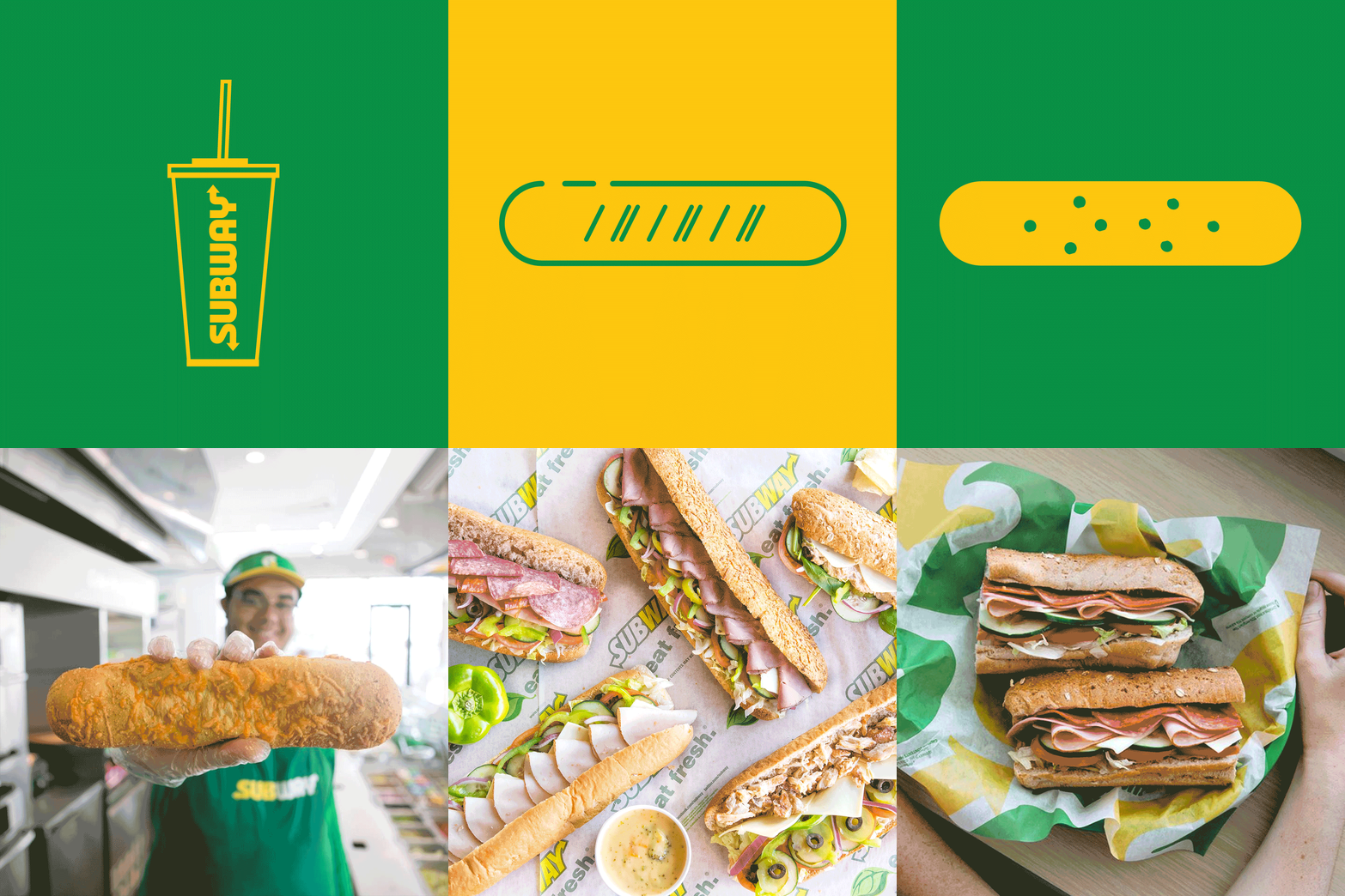
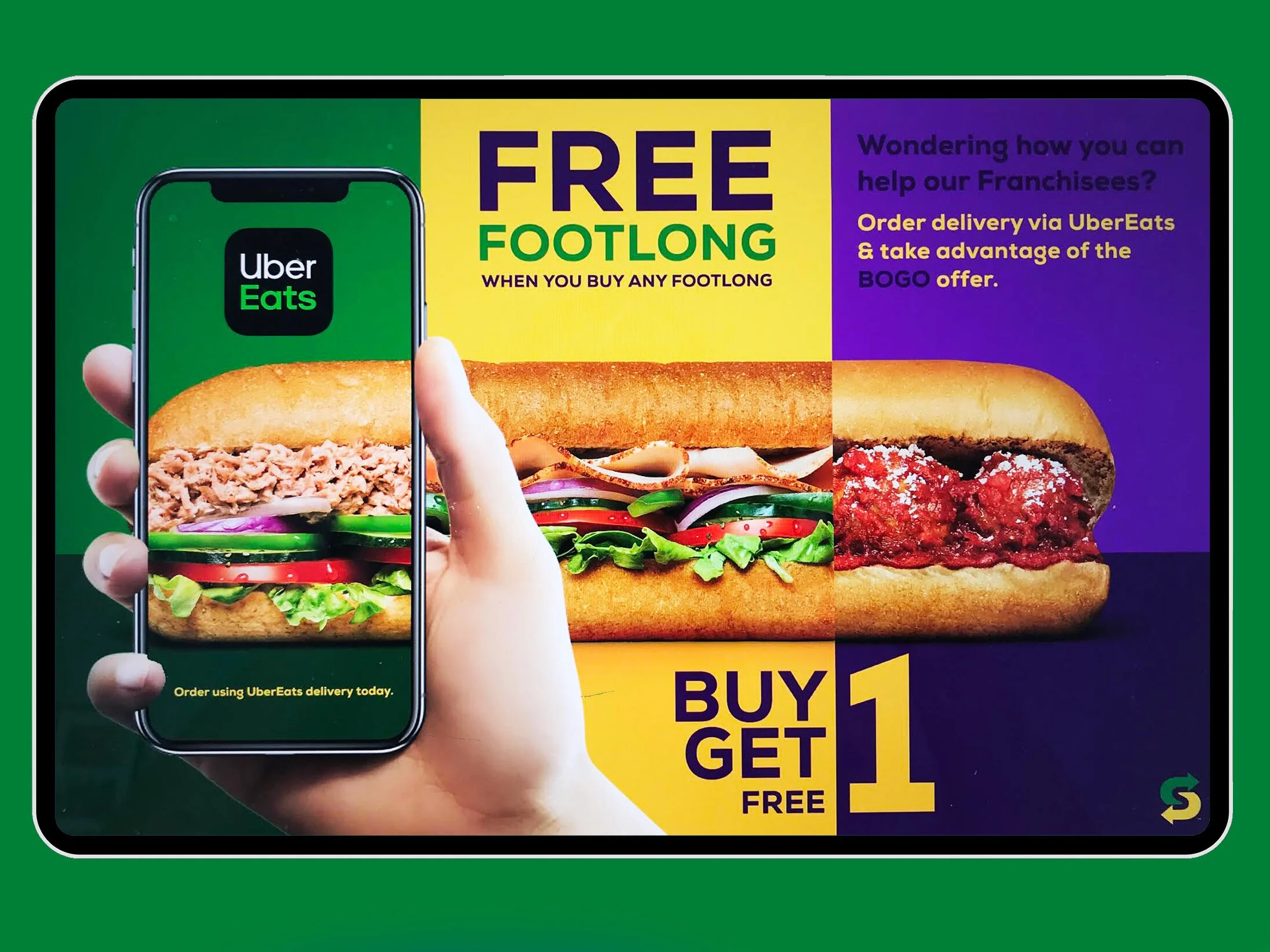
At the time, internal teams and franchise owners had limited access to cohesive, Subway-branded communication materials. Our objective was to create a clear visual system and develop branded assets that could support ongoing corporate and franchisee communications while staying consistent with Subway’s consumer-facing identity.
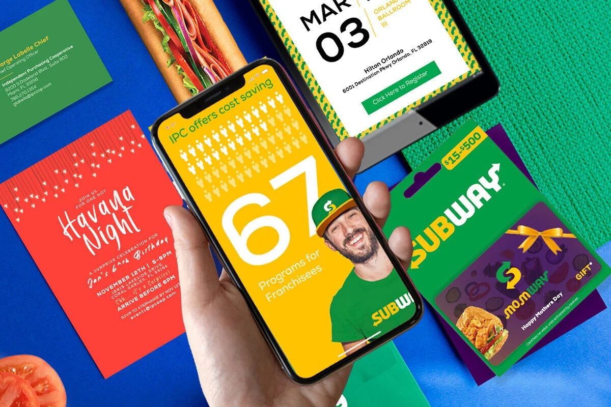
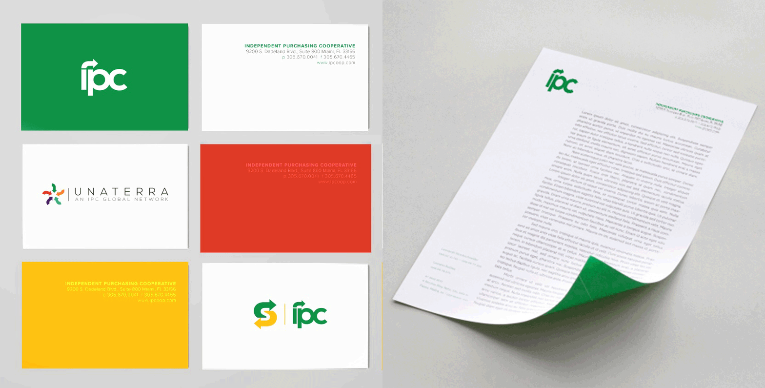
From 2020–2021, I led the creative direction and design development across internal (IPC) communications, email campaigns, promotional advertising, print materials, digital assets, CMS updates, and corporate web experiences.
Some work cannot be publicly displayed due to confidentiality agreements.
THE CHALLENGE
We identified a visual disconnect between Subway’s consumer-facing brand and the materials being used internally by corporate teams and franchise owners.
The goal became more than designing individual campaigns — we needed to create a cohesive visual foundation that could support ongoing communication across multiple teams, platforms, and locations.
CREATIVE PROCESS
CONCEPT → DESIGN SYSTEM → PRODUCTION → LAUNCH
We first established a consistent color palette, typography hierarchy, and visual approach for corporate communications.
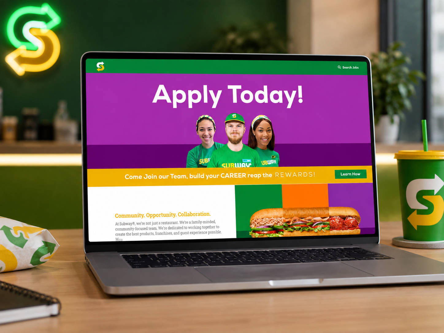
From there, we redesigned key communication experiences, including the internal CMS platform and corporate website, collaborating closely with developers, writers, and internal stakeholders to ensure the experience felt aligned with the Subway brand.
The system was then extended across email campaigns, promotional advertising, print communications, digital assets, and franchisee marketing materials.
We also developed flexible creative assets and a request-based system that allowed franchise owners to access or request location-specific materials while maintaining brand consistency.
The result was a more unified communication system connecting Subway’s internal, franchisee, and customer-facing brand experiences.
ART DIRECTION · CAMPAIGN DESIGN · EMAIL MARKETING · DIGITAL DESIGN · PRINT · PRODUCTION
LA PARFAIT
Luxury Skincare Brand Campaign
OVERVIEW
La Parfait Cosmetics is a Florida-based, woman-owned luxury skincare brand focused on delivering a personalized and elevated customer experience.
In collaboration with Into the Blue Agency, Weart2 Studio developed a refreshed creative direction designed to strengthen La Parfait’s position as a premium skincare brand while creating a more inclusive and emotionally engaging visual identity.
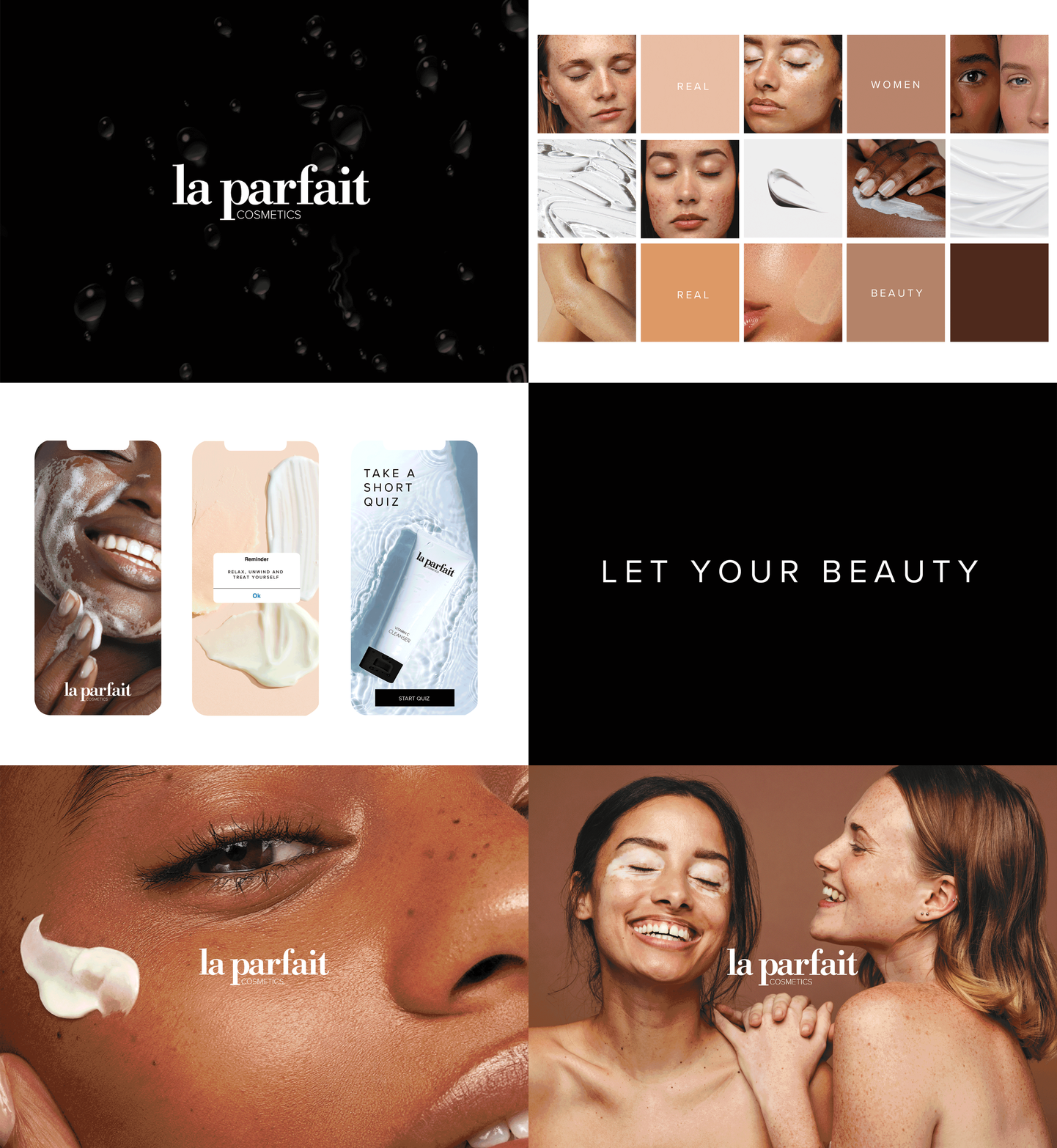
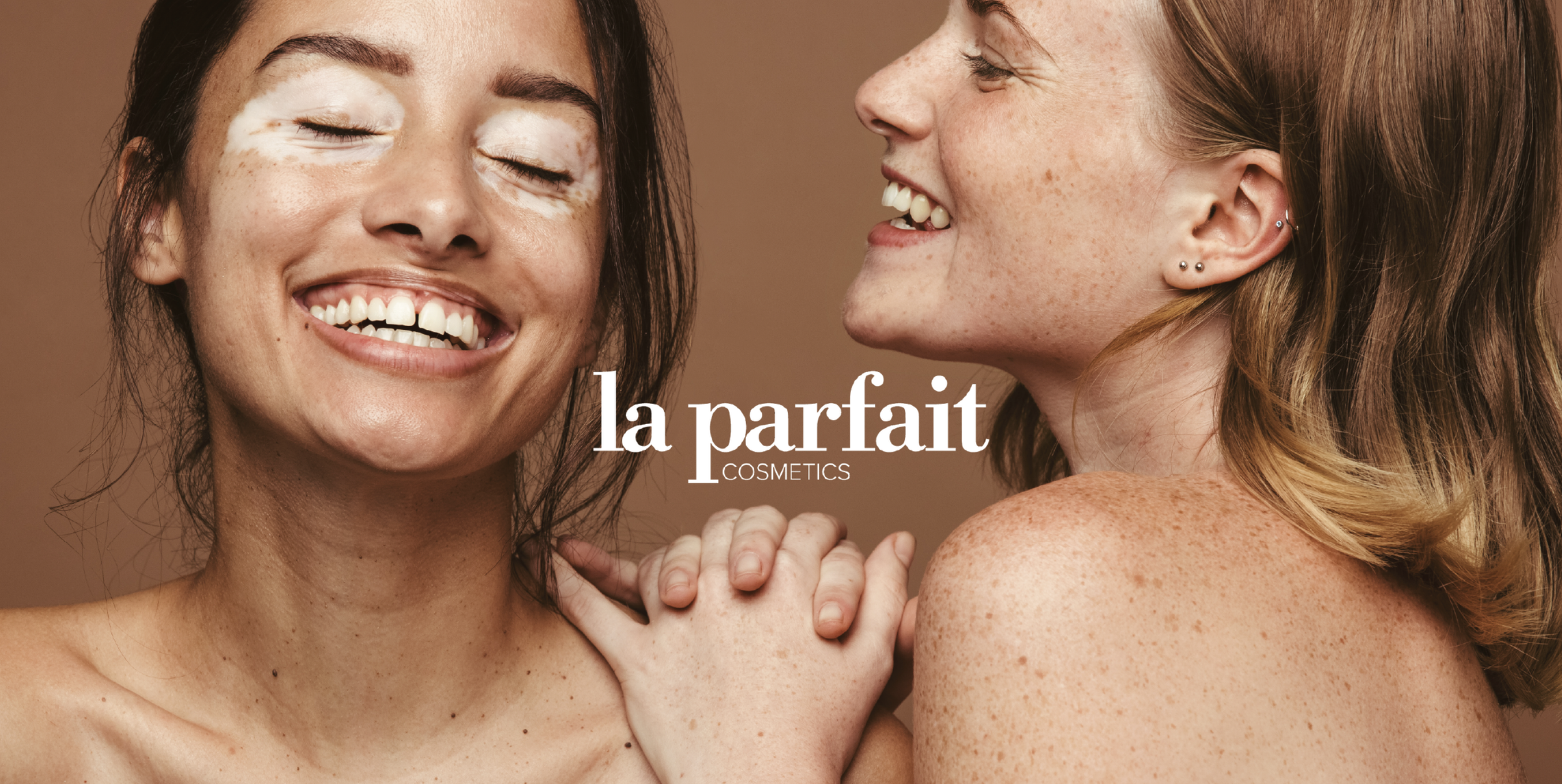
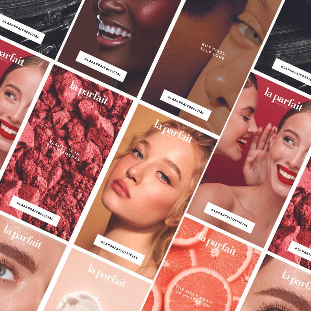
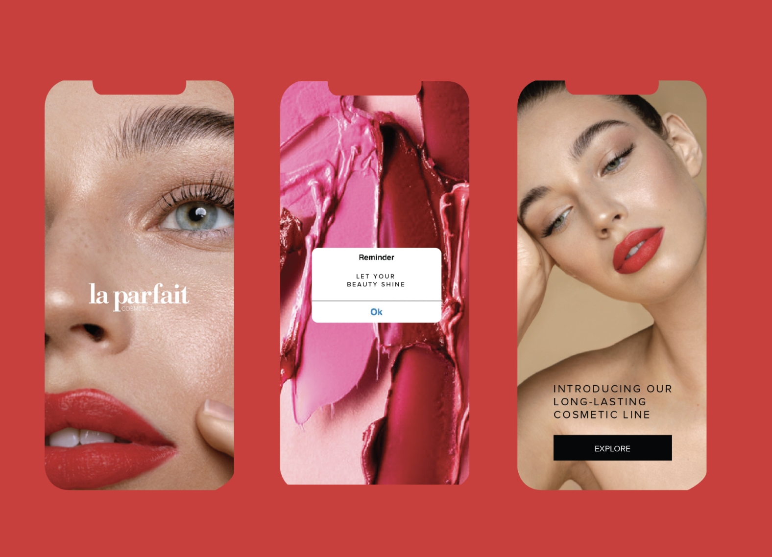
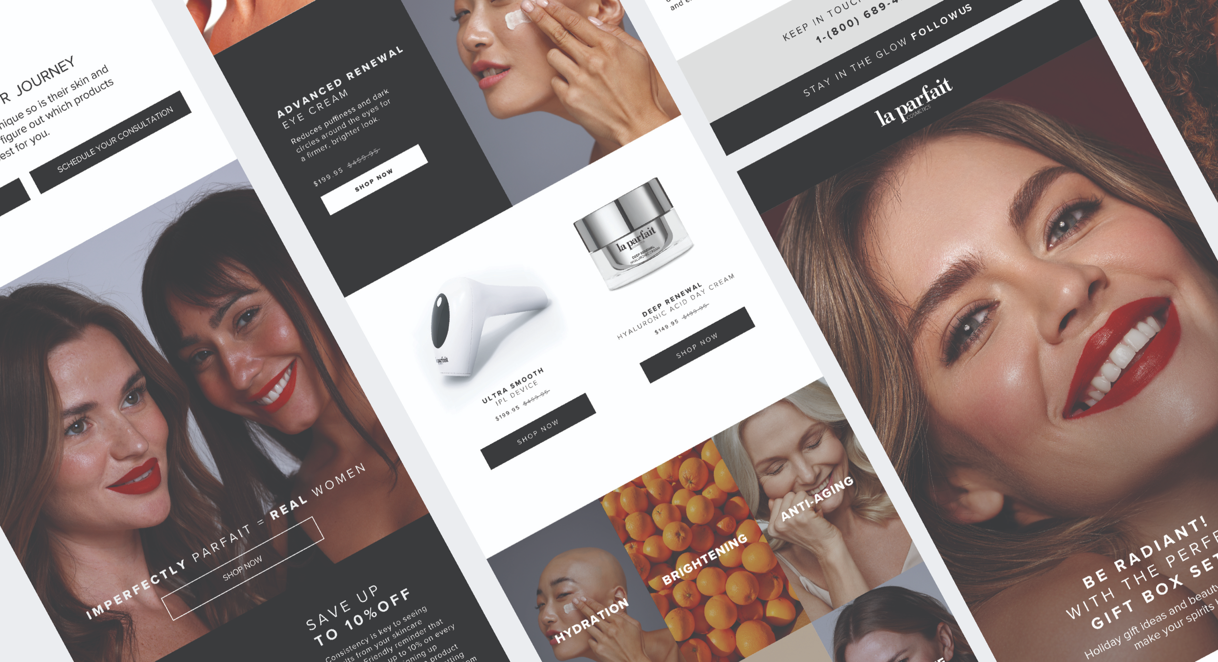
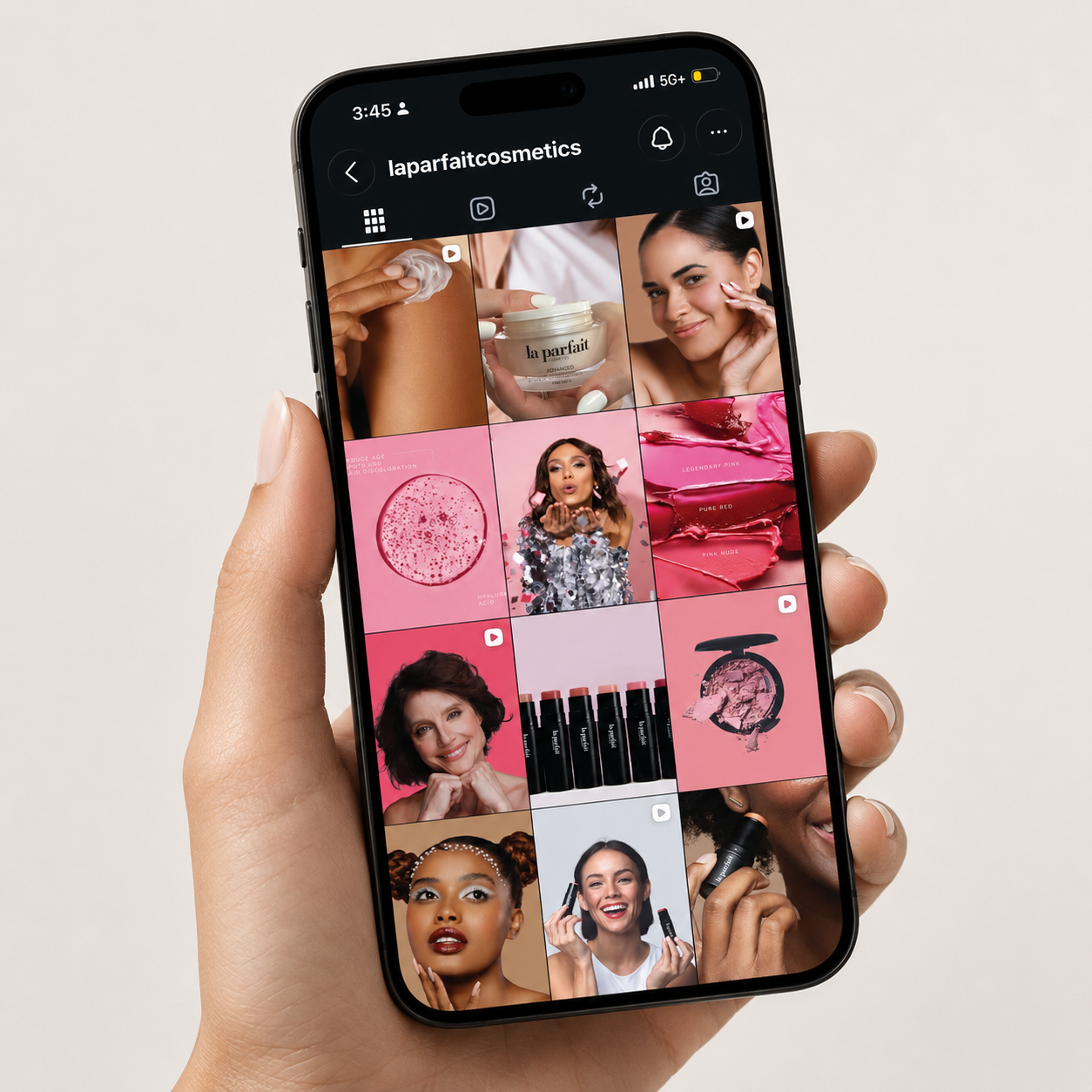
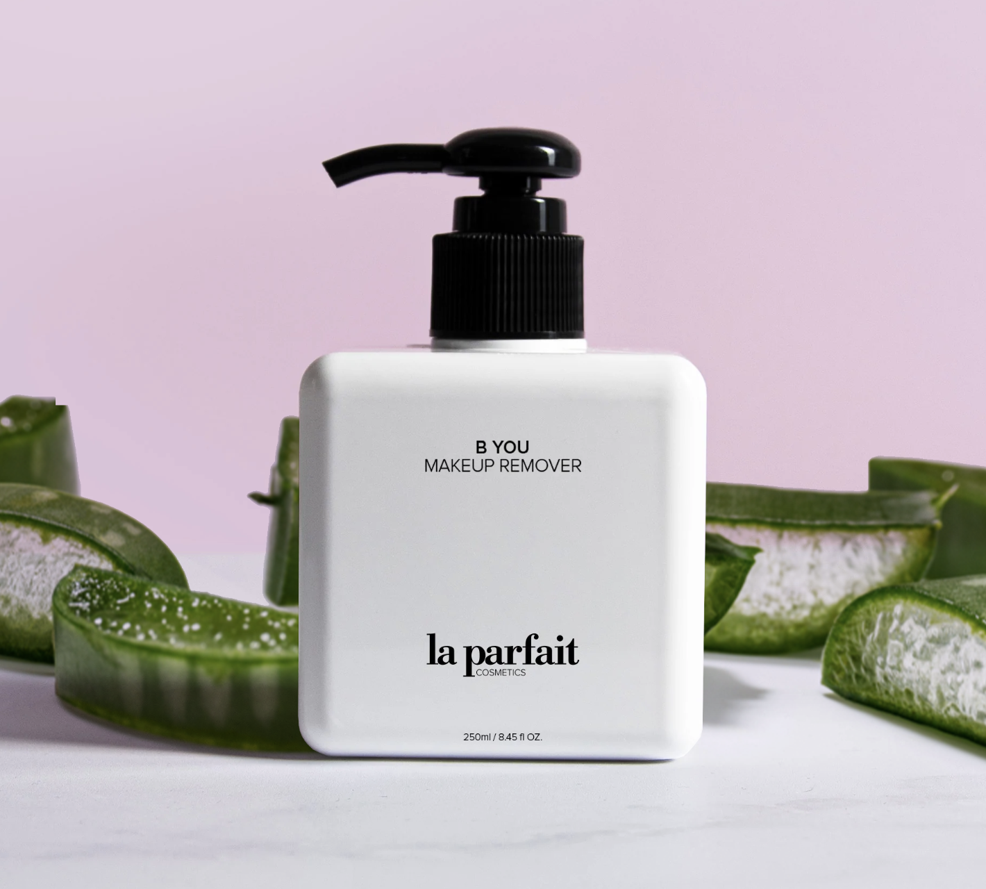
The creative direction maintained the brand’s minimalist black-and-white packaging while introducing color through product ingredients, skincare textures, photography, and diverse beauty imagery. The goal was to create a brand experience that felt sophisticated and luxurious, while celebrating women across different ages, skin tones, and definitions of beauty.
THE CHALLENGE
La Parfait already had a strong product offering and minimalist visual foundation, but the brand needed a more distinctive creative system that could better communicate its premium positioning and connect emotionally with its audience.
Our challenge was to elevate the brand without losing its clean aesthetic, while creating a stronger sense of personality, inclusivity, and personalization across digital touchpoints.
CREATIVE DIRECTION
We developed a clean yet vibrant visual system built around La Parfait’s existing black-and-white identity.
Color was introduced through botanical ingredients, product textures, skincare formulations, and model photography, creating contrast while keeping the overall brand sophisticated and minimal.
We also proposed a more personalized online customer journey, including a custom skincare questionnaire designed to help customers identify the products best suited to their individual needs.
The refreshed direction was implemented across:
Website Design · Photography · Social Media · Paid Advertising · Email Marketing · Campaign Launches
STUDIO TRIO
Brand Identity & Launch Campaign
OVERVIEW
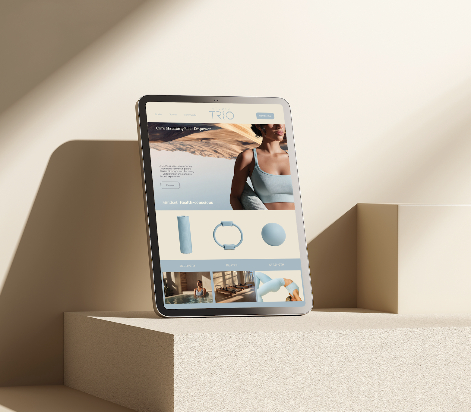
Studio TRIO is a modern wellness concept built around three interconnected pillars: Pilates, Strength, and Recovery. The brand was created to offer an elevated, holistic fitness experience where movement, discipline, and restoration work together as one system.
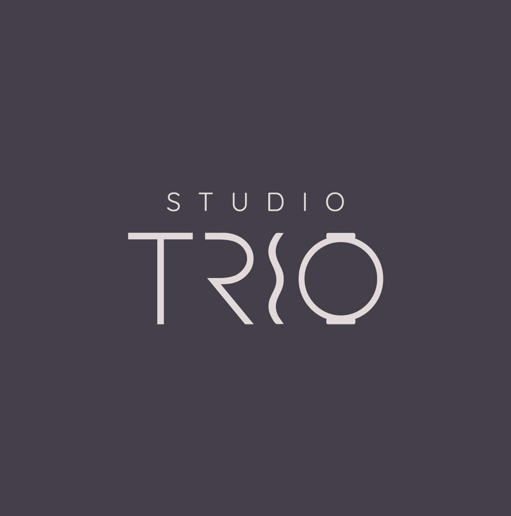
In collaboration with Into the Asset creative.Co, Weart2 Studio developed the brand from the ground up, creating the logo, visual identity, brand guidelines, website, social media system, email funnel templates, launch calendar, and opening-event assets.
The goal was to build a cohesive brand that felt modern, intentional, and premium while still feeling approachable and community-driven.
THE CHALLENGE
Studio TRIO needed a cohesive brand launch that clearly connected its three core offerings: Pilates, Strength, and Recovery.
The goal was to create an elevated wellness identity that felt modern, balanced, and community-driven.
CREATIVE DIRECTION
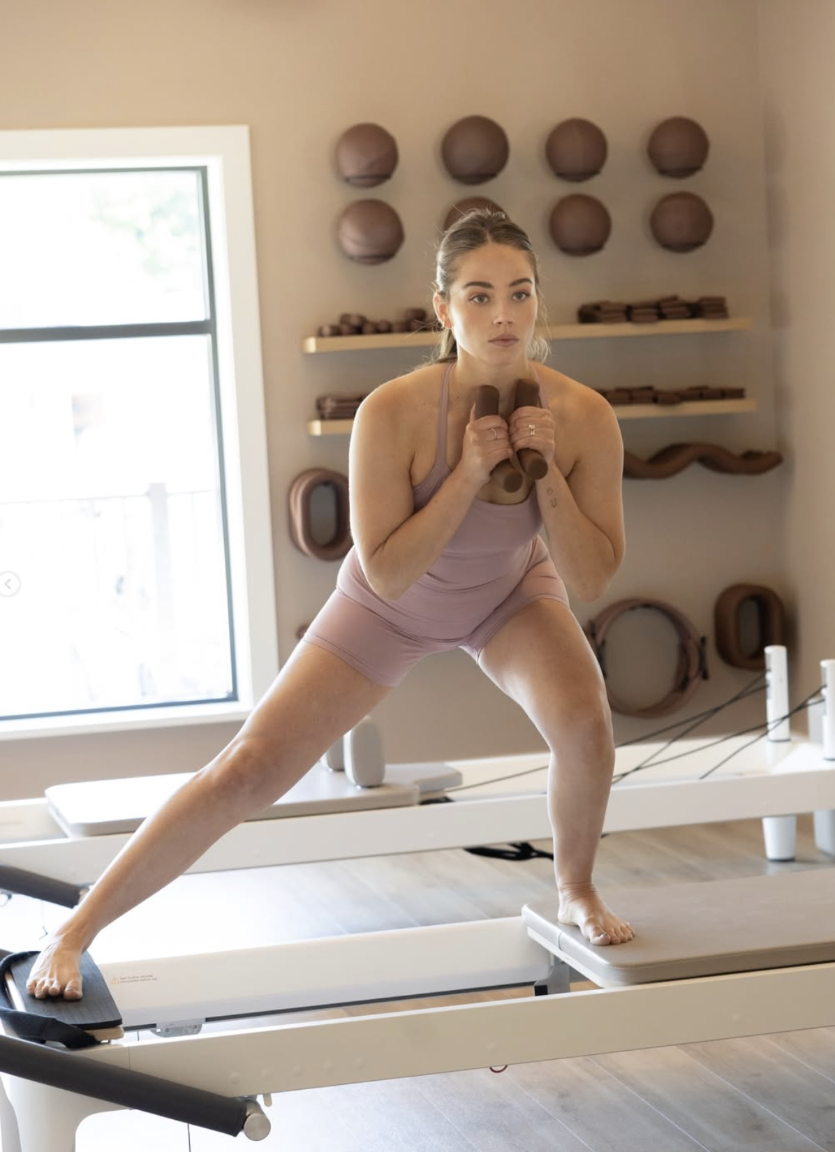
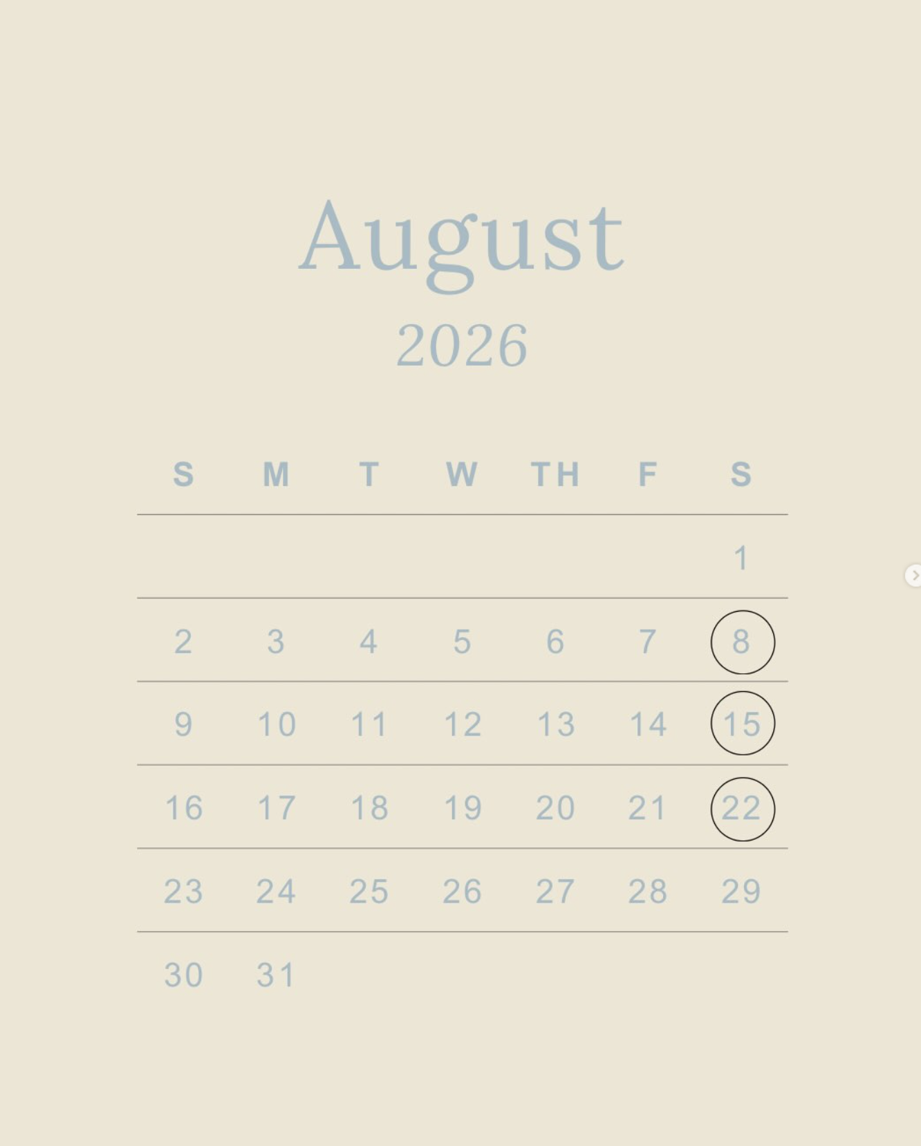
We developed a minimalist visual system built around a custom TRIO logo, soft neutral and powder-blue tones, refined typography, wellness photography, and iconography representing the three pillars.
The brand was designed to feel calm, strong, and premium.
BRAND + DIGITAL SYSTEM
We created a complete launch toolkit including:
Logo & Brand Guidelines · Website · Social Media · Email Funnel Templates · Digital Campaign Assets · Content Calendar · Branded Collateral
The system was designed to work consistently across both digital and physical applications.
LAUNCH CAMPAIGN
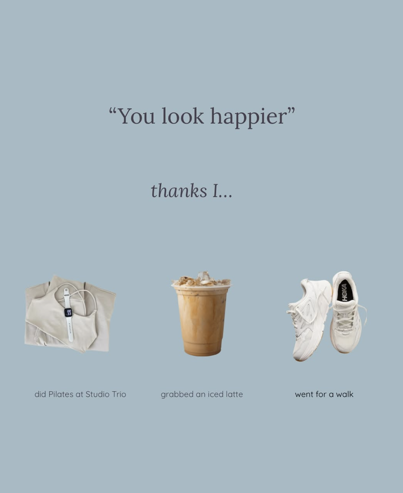
For the studio launch, we developed social and promotional assets introducing: Pilates · Strength · Recovery · Classes · Community · Membership · Opening Events
We also created launch calendars, event graphics, schedules, and supporting branded assets to keep every touchpoint cohesive.
CREATIVE PROCESS